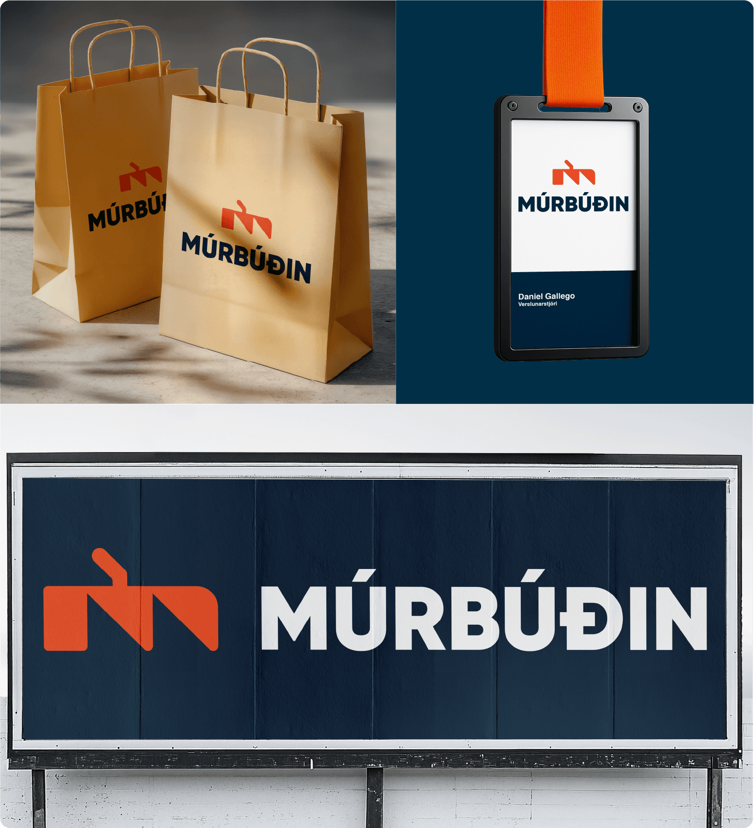
Múrbúðin
Read time:
3-4 min
Client:
Iceland University of the Arts
Industry:
construction
Start:
End:
Duration:
17 days
This project was assigned as part of a school brief focused on redesigning an existing logo for a predetermined company, in this case Múrbúðin.
The original logo presented several issues: it felt outdated, had little connection to the company’s industry, and used colours that did not reflect its field. Additionally, when I reached out to the company, there appeared to be limited knowledge or documentation regarding the existing identity.
The objective of the redesign was therefore to create a modernised logo that better aligned with the company’s industry while still maintaining a connection to its original identity and heritage.
Logo
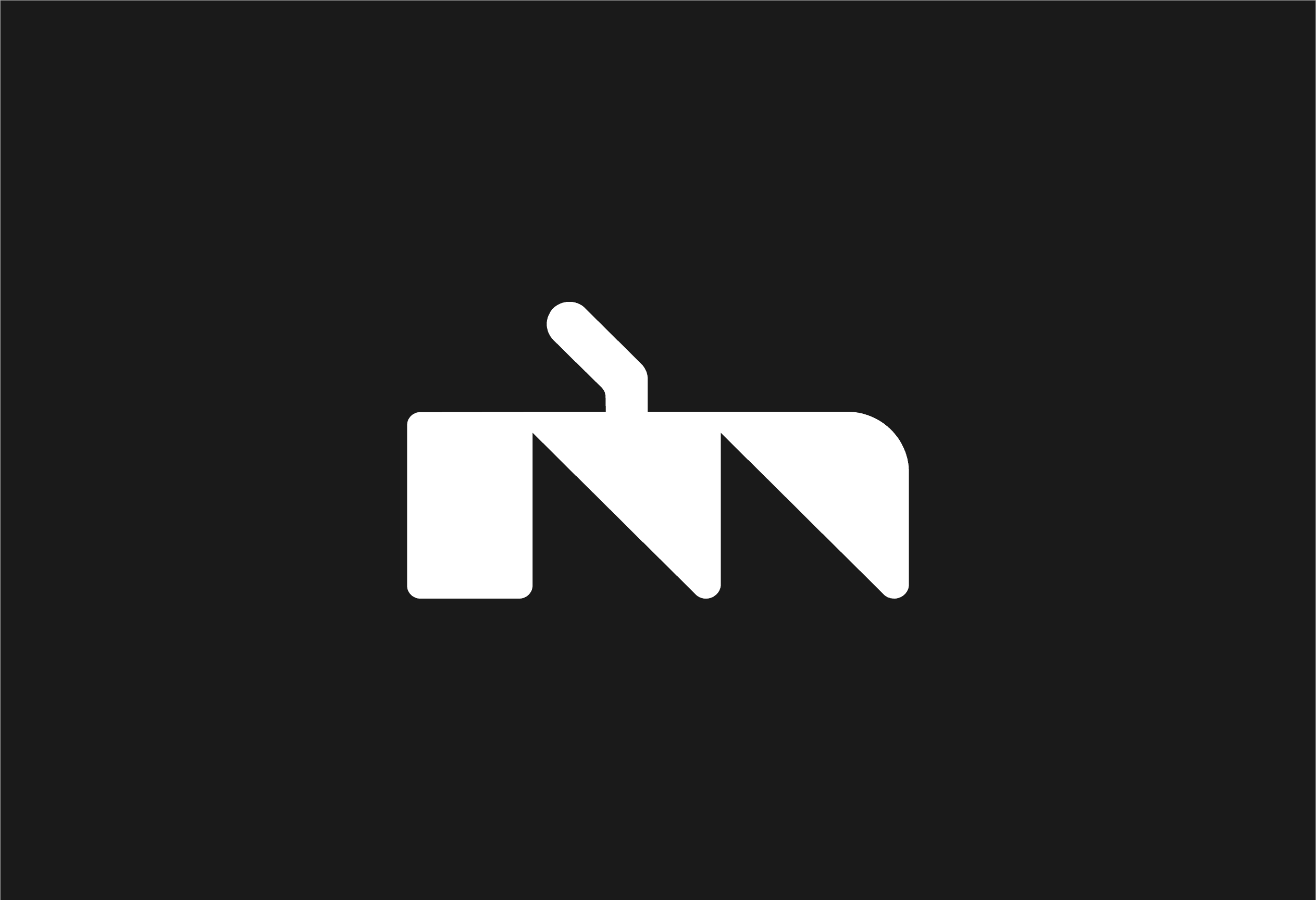
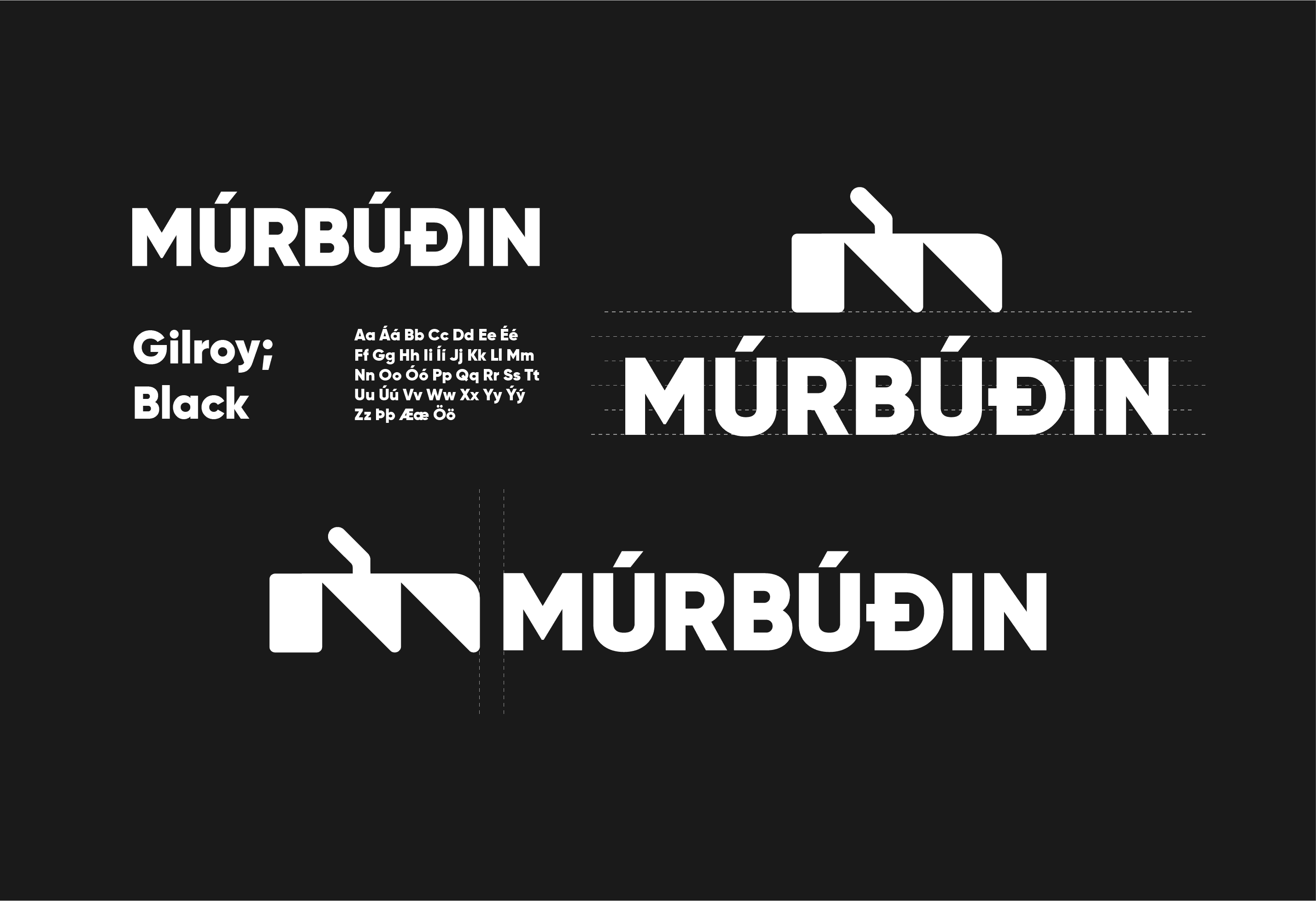
The initial letter of the company’s name, combined with a bricklayer’s trowel, was used as the primary design element to clearly communicate the company’s trade and purpose.
Type
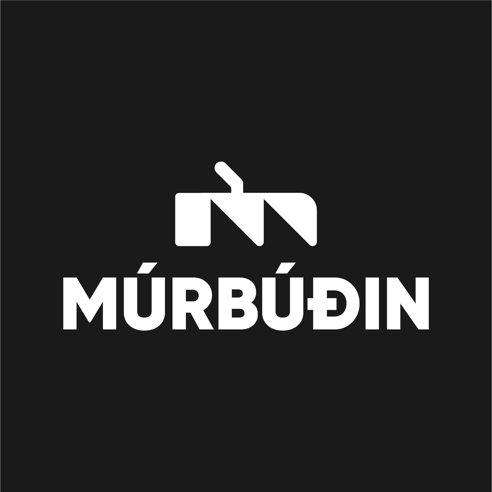
The original typeface was replaced with Gilroy Black to create a more modern and confident visual identity, improving clarity and overall legibility.
Colour
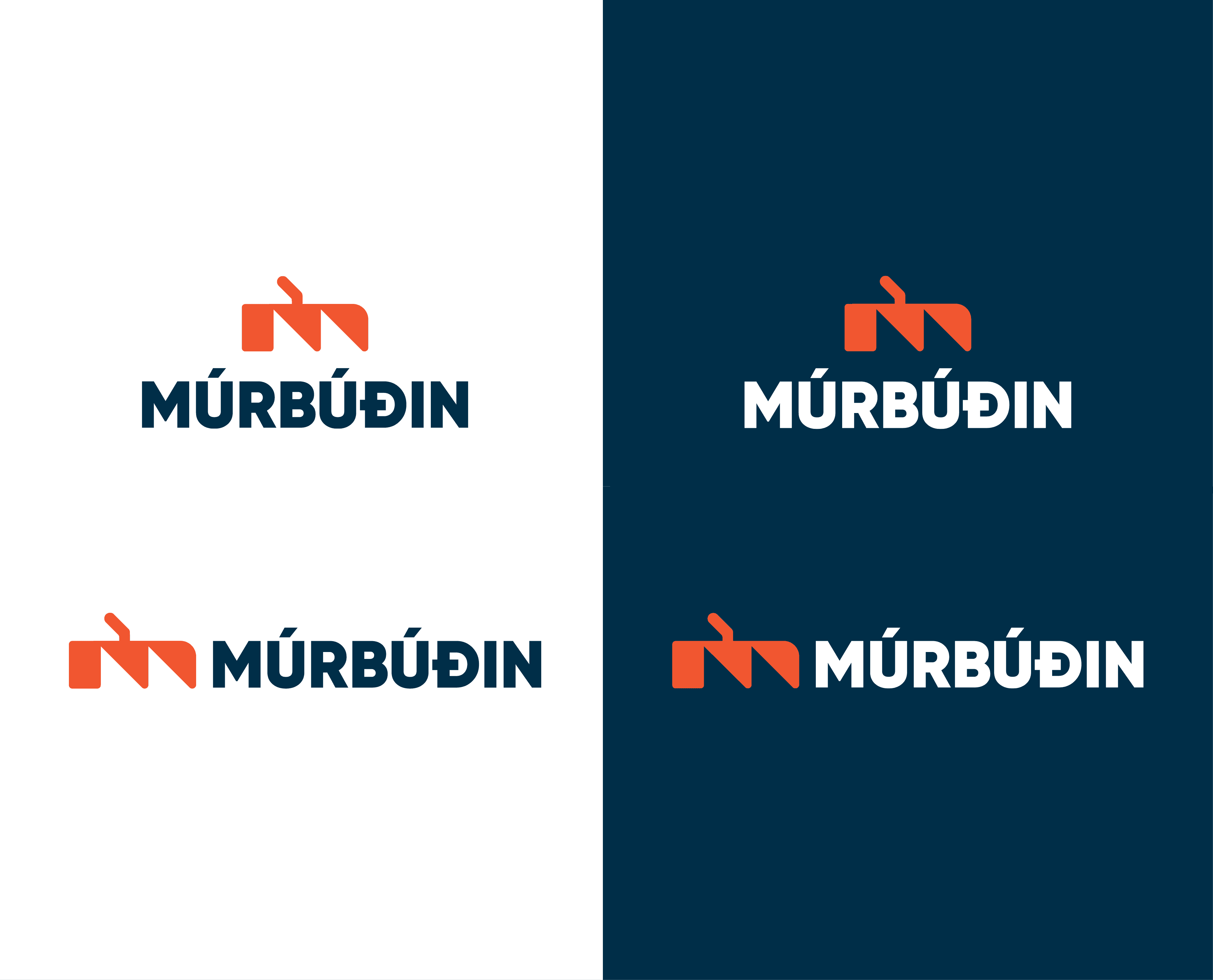
During the research phase, I discovered that Múrbúðin was originally created by a company called Gólflagnir, which explained the origin of the logo’s existing colour palette. To maintain a connection to its roots, I chose to retain this palette in the redesign. However, I adjusted the value of the red tones to better align the identity with brickwork, reinforcing the company’s connection to masonry.
Result
The final design came together in a balanced and cohesive way. The new logo proposal feels modern while still maintaining a connection to the company’s origins, and it more accurately reflects the industry it represents.