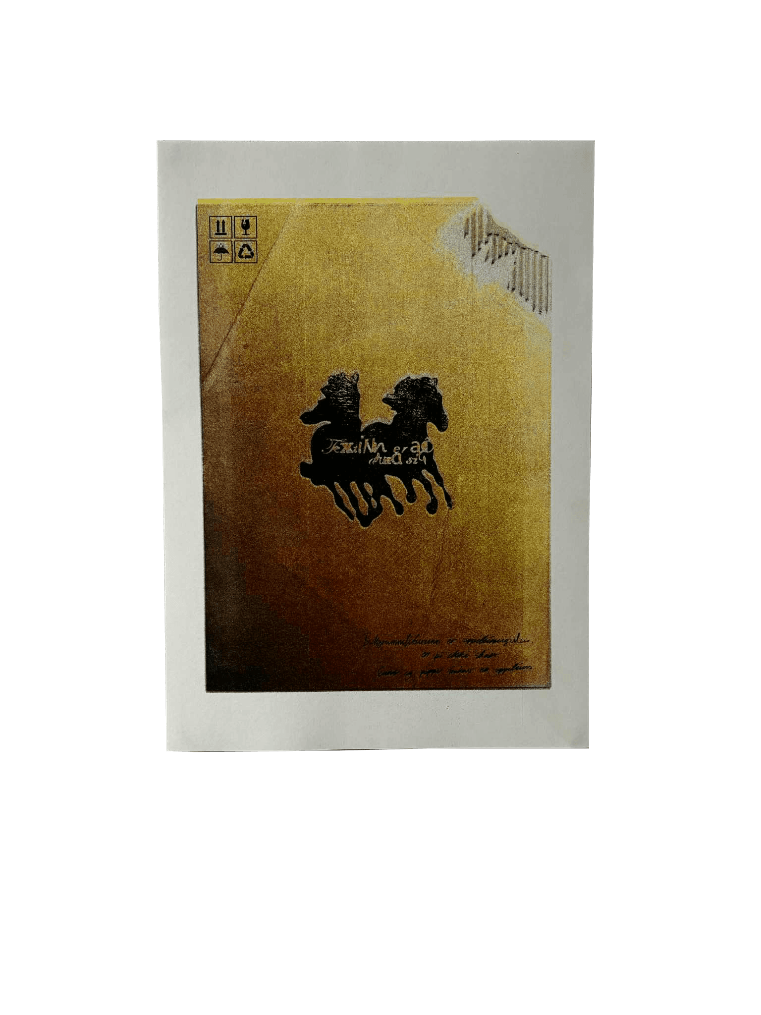
Ed Fella Poster
Read time:
2 min
Client:
Iceland University of Arts
Industry:
education
Start:
End:
Duration:
6 days
For this project, each student was assigned a designer to research and respond to through a design exercise. I was assigned Ed Fella. The task was to select one of the designer’s works, develop a brief prompt inspired by it, and create a poster based on that prompt.
The project encouraged an exploration of the assigned designer’s visual language, working methods, and conceptual approach while translating those influences into an original design outcome.

The prompt.
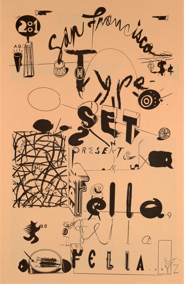
This was the poster I selected as the basis for my analysis and design response.
During my observations, I noted the use of an orange color palette, although the tone felt closer to the natural color of cardboard than to a bright or saturated orange. I also observed that each letter appeared to be rendered in a different typeface or style, creating a playful and highly expressive typographic composition.
Another prominent feature was the use of pencil-like scribbles and hand-drawn marks, which contributed to the poster’s informal and energetic character. I was particularly drawn to the sense of movement created by the typography. The text seemed to rush across the page, conveying speed and urgency, almost like a galloping horse. This dynamic quality became an important part of my interpretation of the work and informed the direction of my own design response.
The prompts I developed from the original Ed Fella poster served as the foundation for my final design.
The references to colour in the prompt informed the muted, cardboard-like tone of the final composition. Similarly, the idea of a horse was incorporated as a visual metaphor for my interpretation of the text as fast-moving and urgent, evoking a sense of motion and speed throughout the design.
Made with Illustrator & Photoshop
Printing.
The posters were risograph printed in A3 format. I used black, magenta, and yellow to achieve the orange tones, with black also serving as the ink for the typography. By layering the different inks, I was able to create variations in value within the orange palette, adding depth and subtle tonal shifts to the final print.